In 2022, I took over rebranding the Brooklyn Nets’ esports team. Previously, the organization had adopted a graffiti campaign that was used for the last few years. While it represented New York’s basketball street culture and the Brooklyn Nets’ classic black and white colourway, it was missing something several components needed to compete in an energetic esports industry.
NETSGC

2022
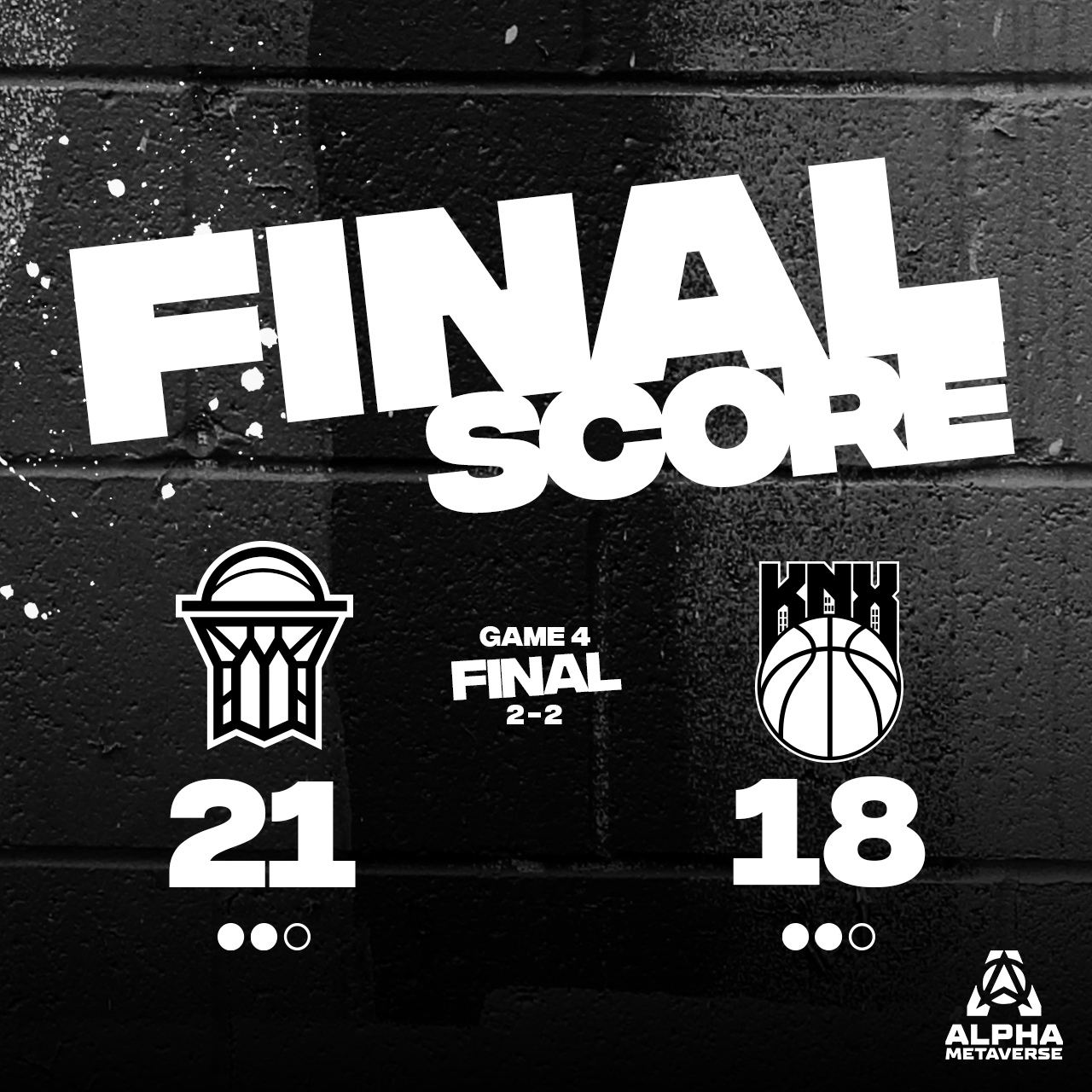
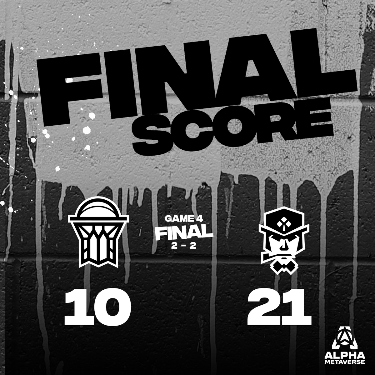
Prior Graffiti Campaign
2022
Prior Graffiti Campaign

2022
Prior Graffiti Campaign
2022
Prior Graffiti Campaign
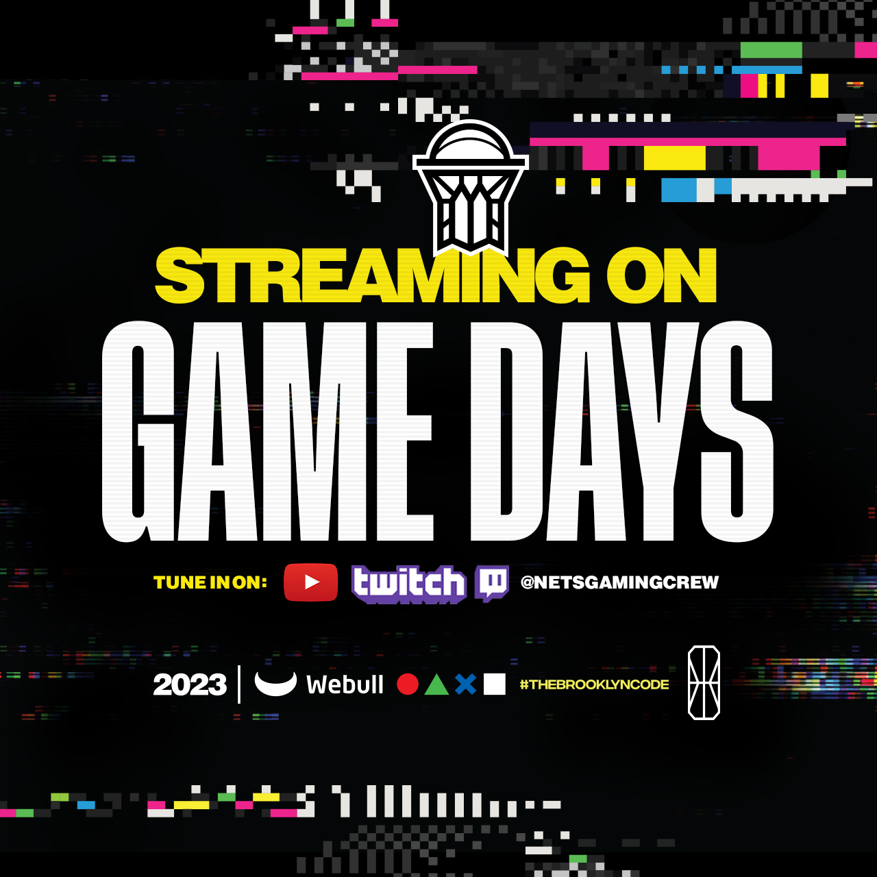
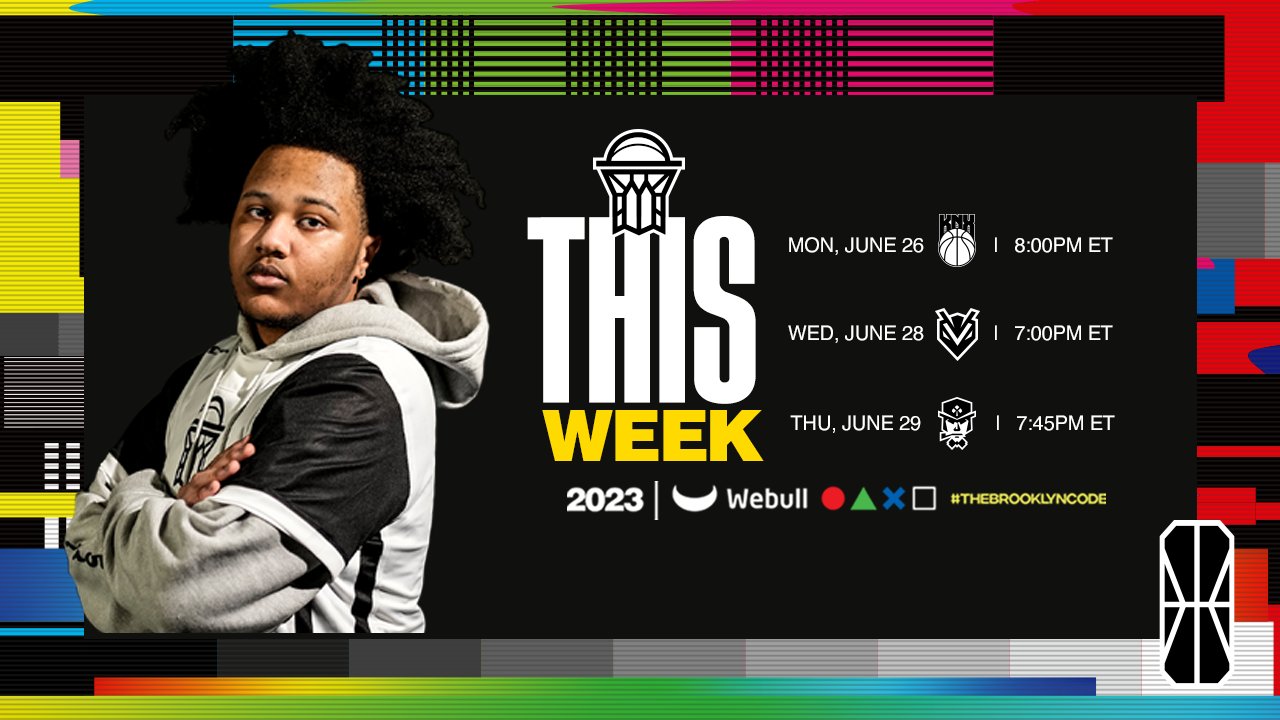
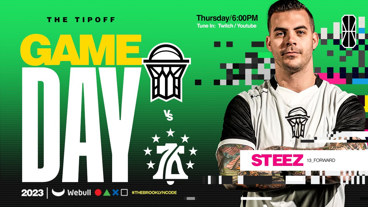
Leading into the 2023 season, we held internal talks on a likely NetsGC logo redesign set for a 2024 launch. In anticipation of that, I wanted to tell a story through our brand. This is how we developed the “Glitch Campaign”. Not only was the look and feel recognizable to our tech savvy audience, it gave us narrative “cheat code” to play outside the typical Brooklyn Nets colourway. We now had the options to stand out in a crowd while establishing a “brand-lore” reason for a logo redesign. Simultaneously, Brooklyn was awarded one of the top picks in the NBA 2K League draft and we were in prime position to draft a local kid as the new face of the franchise. Everything was set to tease the relaunch of our brand a year from now.
NetsGC 2023 (After)
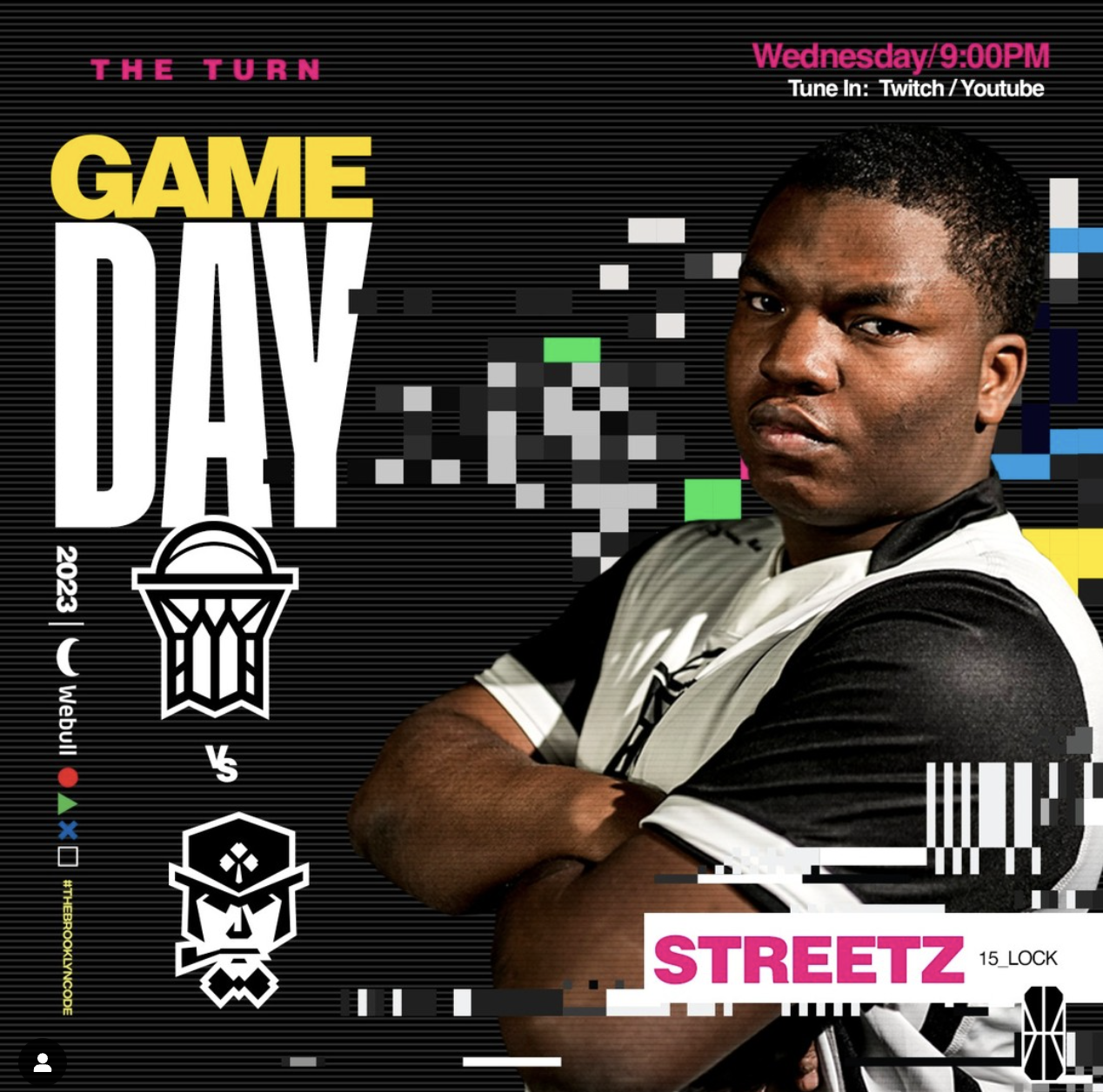
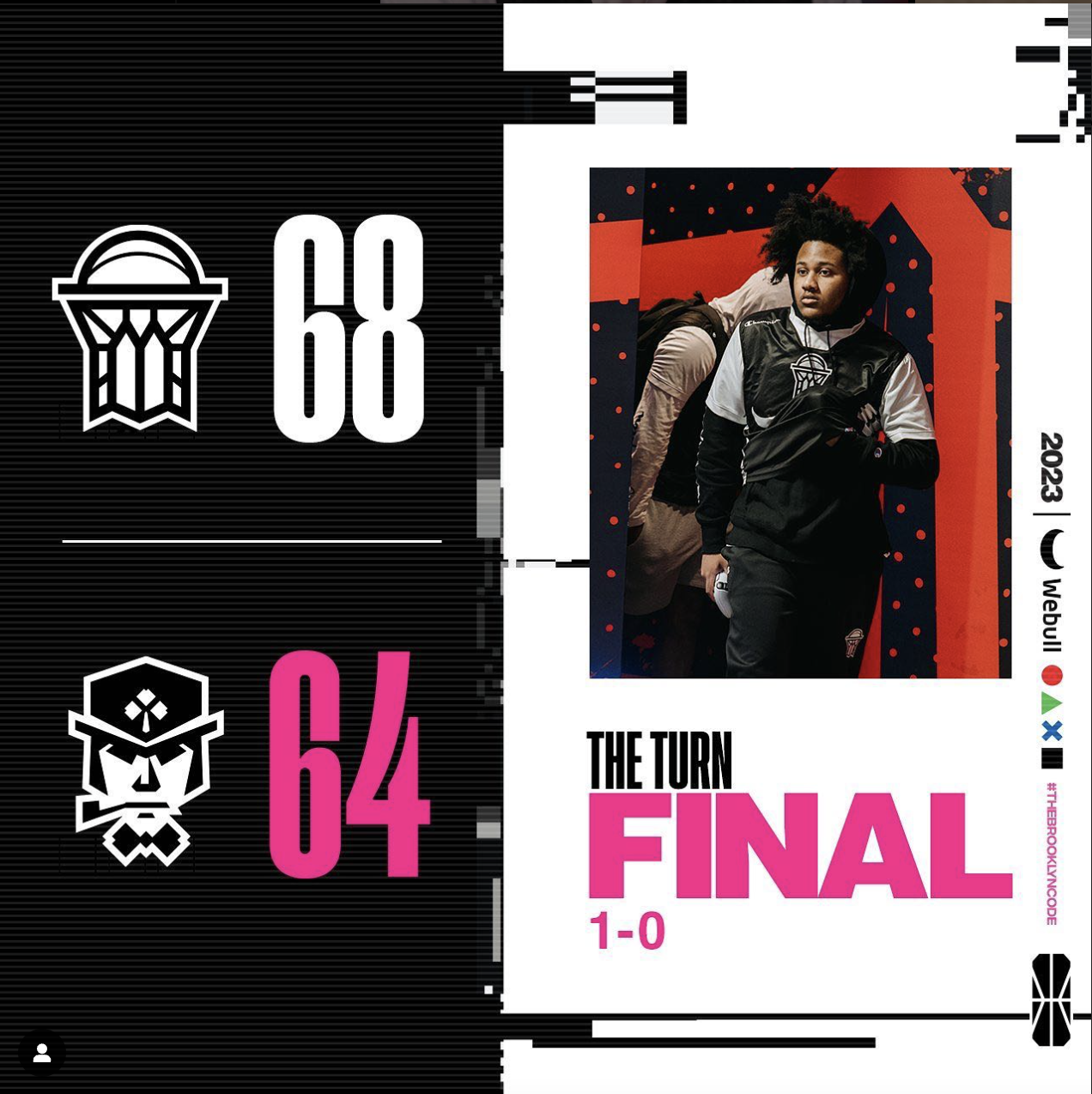
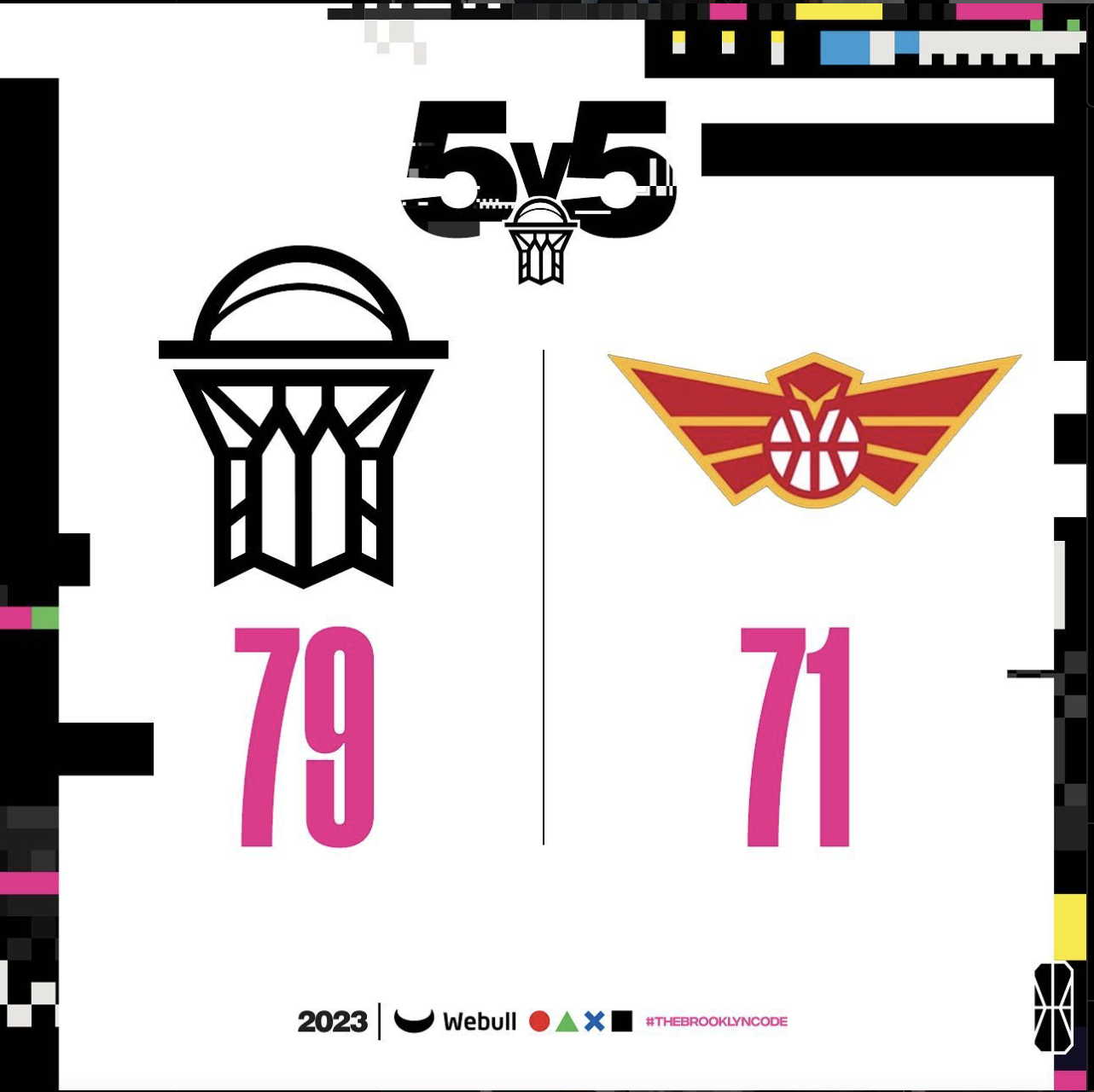
2023 Glitch Campaign
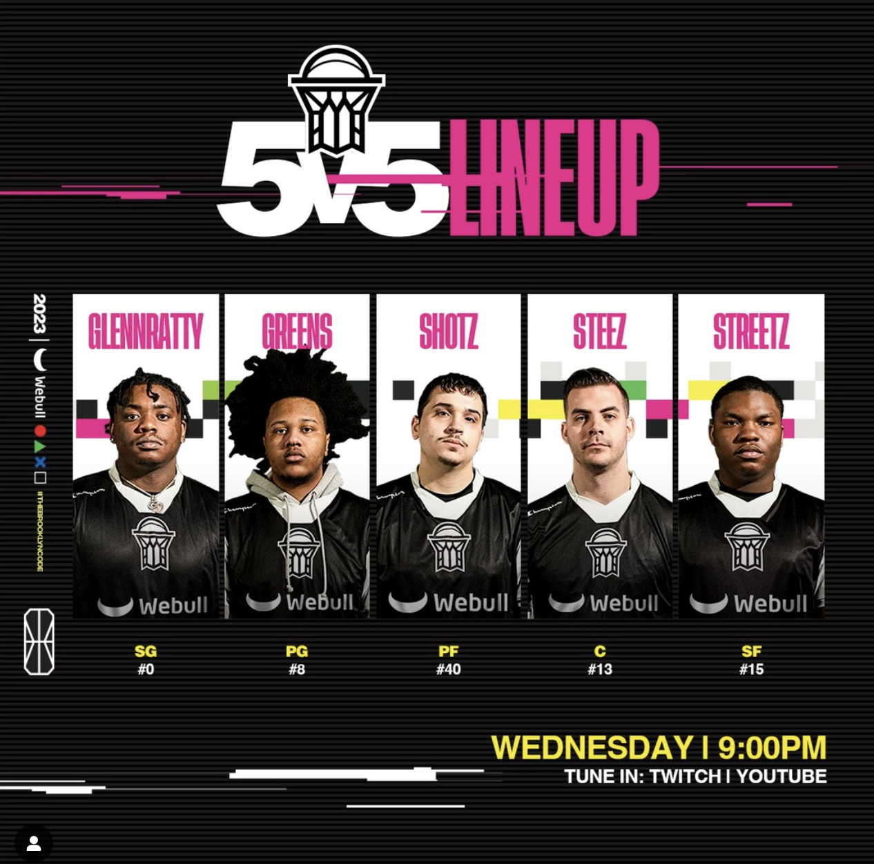
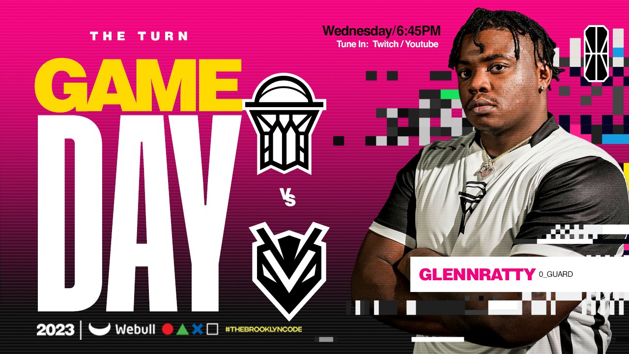
Emphasis on colour and uneven lines to indicate this brand is unlike anything you’ve seen from the Brooklyn Nets. Inclusion of player photos – a must to establish fan connection in a virtual world.


Midway through the 2023 season, we discovered we would no longer be designing the NetsGC logo. Due to improved social metrics, we decided we would build on our previous campaign with “Glitch v2.0”. We pivoted from a narrative of our “brand glitching and evolving into something else” to embracing this new identity we’ve crafted over the last year.
NetsGC 2024
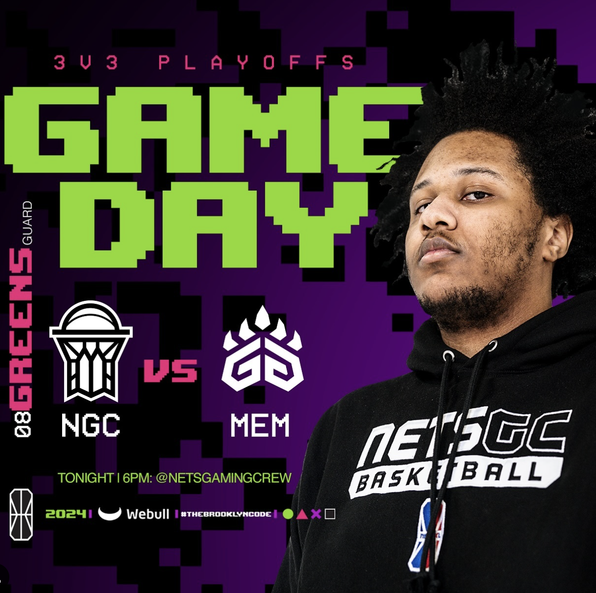

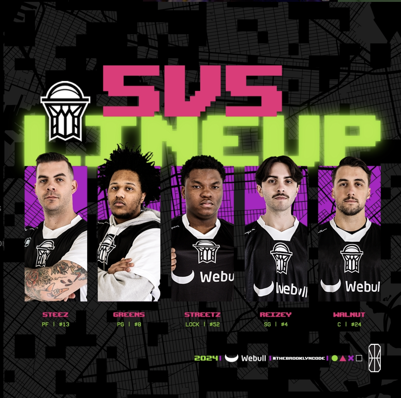

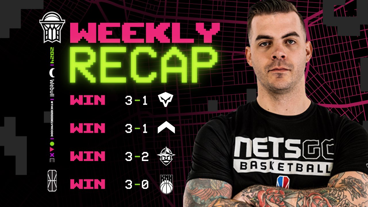
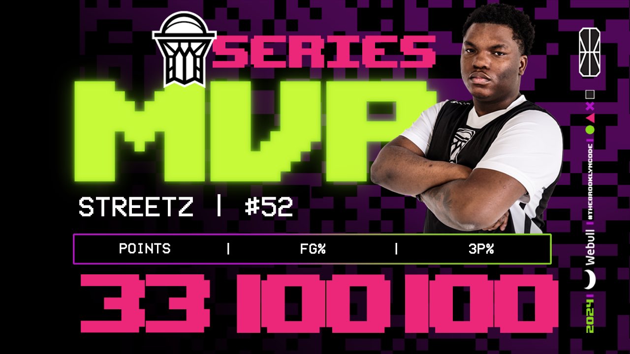
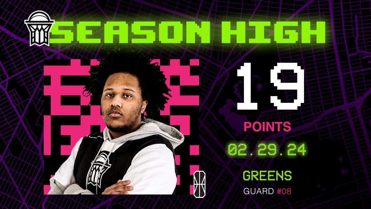
2024 Glitch v2.0 Campaign
Last year’s glitch aesthetic swapped with uneven lines of the map of New York, symbolizing a merge between 2022’s street imagery and 2023’s “chaos” feel.
Non-Brooklyn Nets colours still front and center with an emphasis on video game style font. The exception are the black and white logos subtly stated that our brand was “healing” from the glitches and to tease our “Newspaper” 2025 campaign.


#THEBROOKLYNCODE
This 2-part campaign was titled The Brooklyn Code. It was our esports twist on the Brooklyn Nets’ “The Brooklyn Way” mantra. I wanted to take the pride Brooklynites feel about their borough and inject that into how passionate gamers are about their community. It also captured how NetsGC would represent themselves in competition.
